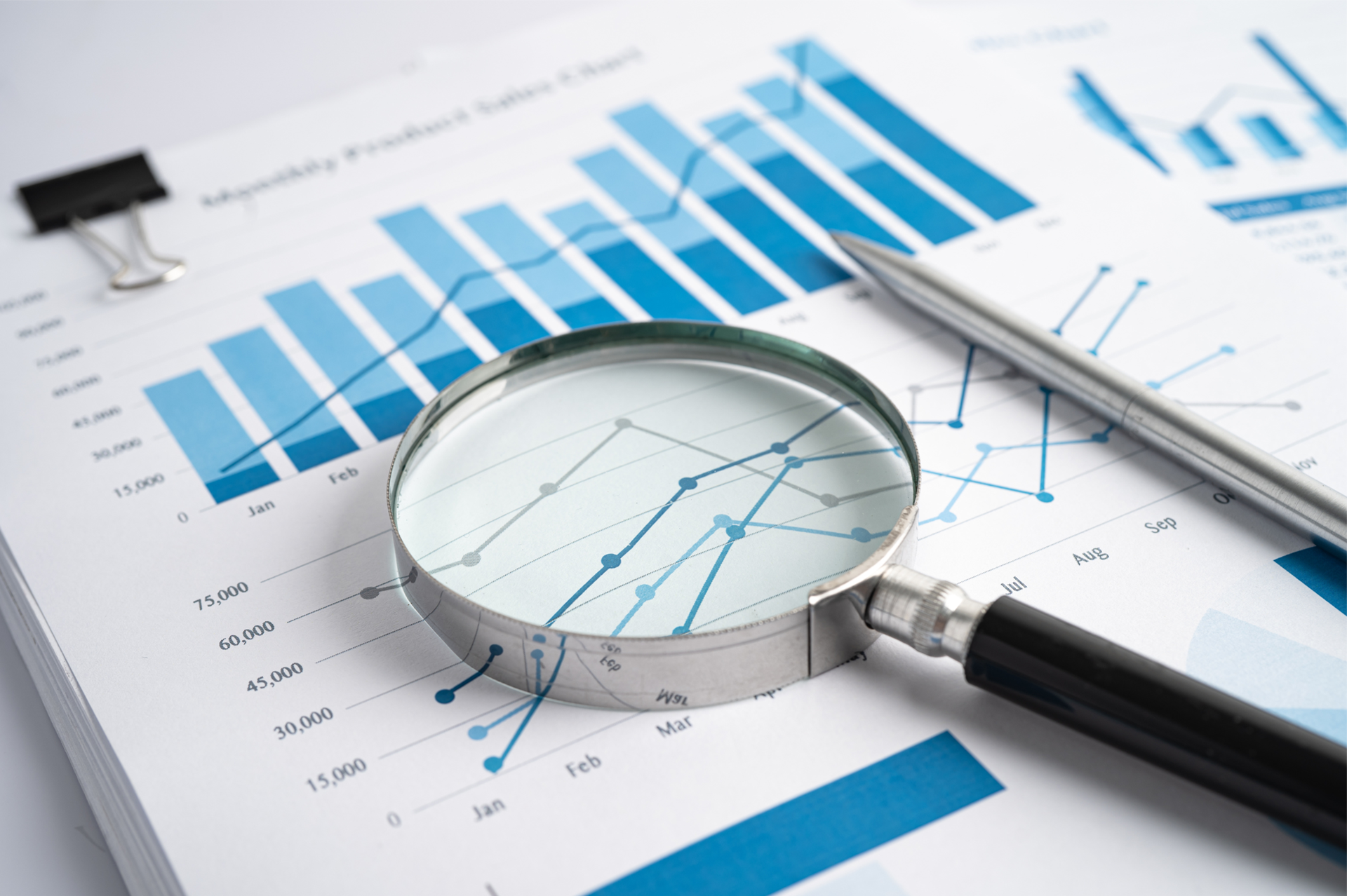
Sales Profitability Dashboard
Sales Profitability Dashboard
Unprofitable business is the quickest way to kill your business which you will soon see on your bottom line. It’s therefore imperative to try and identify it quickly or look for opportunities exist to improve profitability is the sales before tampering with any other process.
For starters, this dashboards ensures that the % Gross Margin is healthy and within an acceptable range. This may however vary over time as the product mix and volumes change during the normal course of business.
Returns
The most damaging driver affecting profitability is product returns. In addition to reducing customer satisfaction levels, returns usually affect profit at their full cost and often represent a lost sale. They are almost always avoidable unlike other drivers such as price, which are determined largely by external forces such as competitor behaviour. This dashboard therefore tracks:
- # of Returns
- Value of Returns
- % Returns to Overall Revenue
Order Profitability
Order profitability is great as it enables you to manage the profitability before the goods and services have been delivered. Depending on your contracts you still might be able to change an unprofitable order into a favourable one – but only if you can pick it up in time
This dashboard therefore has some key measures which must be visible (by order, customer, item etc. ) to help identify this:
- Expected % Gross Margin
- % Discount
- Value of Discounts
- % Actual Order Price to Last 3 Months Average Price
Item Profitability
When viewing item profitability it’s important that the Cost of Sales is accurately recorded in the underlying system.
Your costing model may be very simple (Moving Average) or very complex (Activity Based Costing) or somewhere in between (Standard Costing).
Whatever it is, make sure it’s up to date and that the rules are applied consistently. In many companies this process is not done very well, the ned results is that you don’t know that unprofitable products are being cross subsidised by profitable ones. Solving the problem is actual quite straightforward once you have the visibility and whatever action you take will make you more cash:
- Stop Selling the unprofitable items
- Ask the customer for a price increase
- Sell the customers more generic products that they can afford that are more profitable for your business
The KPIs and measures used are the same as Order and Item profitability. The analysis is performed at the item or item grouping levels.
Customer Probability
Understanding Customer Profitability is probably the trickiest the profitability dashboards. In some businesses, customer probability is the same as Item profitability except that they data is aggregated by customer and not just item.
In your business you may need to track and allocate non item/service costs associated with the customer. For example:
- Value of Rebates
- Global Discounts
- Delivery costs (if not costed into the item)
- Cost of credit
- Cost of Account and Relationship Management
- Cost of complex customer processes that need to be complied with
- Cost of excessive customer standards
- Cost of Tenders
This section of the dashboard is where the sweet fruit grows. Let us help you harvest the allusive super profits.