Empowering Financial Strategy
Transforming Business Performance with KPI Management Solutions
Blog

In the world of finance, numbers tell a story. However, that story is often buried beneath layers of spreadsheets and complex datasets. For financial professionals, the challenge is not just about understanding these numbers but also presenting them in a way that drives decision-making and inspires action. Enter data visualisation – the art of transforming data into clear, compelling visuals. Among the tools that have proven especially powerful are the line graph and the waterfall chart. These visuals help finance teams translate dry statistics into impactful narratives. In this article, we explore how these graphs can transform financial storytelling. The Importance of Data Visualisation in Finance Finance professionals are accustomed to handling vast amounts of data, from profit margins and revenue growth to expense tracking and risk assessments. Yet, presenting these figures effectively to stakeholders is a different ballgame. Visualisation simplifies this process, turning complex data sets into accessible insights. When done correctly, data visualisation: Enhances comprehension: Humans process visuals 60,000 times faster than text, making it easier for stakeholders to grasp key information quickly. Drives decision-making: Clear and compelling visuals help executives make informed decisions without wading through dense reports. Highlights trends and outliers: Visual tools can bring hidden trends and anomalies to light, prompting timely actions. Improves understanding and communication with business - Business doesn't always get what Finance is trying to communicate and good visualisations go a long way to bridging the gap. Better communication improves alignment to strategic financial goals. The line Graph: Unravelling Trends Over Time The line graph, also known as a stream graph or a stacked area graph, is a powerful tool for visualising changes in data over time. It is especially effective in showing how multiple categories contribute to an overall trend. In finance, line graphs can illustrate revenue streams, expense categories, or investment performance in a visually engaging manner. Use Case: Revenue Streams Analysis Imagine a financial report for a company with diverse revenue streams, such as product sales, services, and subscriptions. A line graph can display how each stream has evolved, highlighting peaks and troughs. The thickness of each ‘line’ represents the contribution of that revenue stream to the total, making it easy to spot which areas drive growth. Benefits of line Graphs: Trends Made Simple: Displays how multiple components evolve over time. Visual Impact: The fluid, organic design makes it easier to follow changes. Comparative Insight: Helps compare different categories intuitively. The Waterfall Chart: Bridging the Gap Between Figures Waterfall charts excel at breaking down the cumulative effect of sequential data points, making them ideal for financial analysis. They help bridge the gap between figures by showing how individual elements contribute to a total. Commonly used in profit and loss statements, budget analysis, and variance reports, these charts provide clarity in understanding how specific actions impact the bottom line. Use Case: Profit and Loss Analysis A financial analyst preparing a quarterly report might use a waterfall chart to demonstrate how various factors—like increased sales, higher marketing spend, and cost savings—impacted net profit. The chart’s structure, with its clear progression from starting figures to the final result, makes it easy for stakeholders to follow the financial narrative. Benefits of Waterfall Charts: Clarity: Simplifies complex financial data by showing individual contributions to total figures. Transparency: Clearly distinguishes between positive and negative impacts. Decision Support: Helps executives understand the key drivers of financial performance. Choosing the Right Visual for the Right Data Selecting the appropriate visual tool depends on the story you want to tell: Use line graphs for illustrating trends across multiple categories over time. Opt for waterfall charts when you need to detail the step-by-step impact of specific factors on an overall financial figure. By mastering these tools, finance professionals can enhance their storytelling, transforming raw data into insights that drive strategic decisions. Conclusion: From Data to Decisions The ability to visualise data effectively is a powerful advantage. The line graph and waterfall chart are more than just visual aids—they are essential tools for financial professionals looking to make data-driven decisions that resonate with stakeholders. By adopting these techniques, finance teams can turn numbers into narratives that not only inform but also inspire action. In the end, the power of finance lies not just in analysing data but in presenting it with impact.

In the ever-evolving financial landscape of 2025, CFOs are tasked with navigating complexities ranging from global economic shifts to technological advancements. The ability to track and analyse the right financial Key Performance Indicators (KPIs) is no longer a luxury but a necessity. These metrics not only provide insight into an organisation’s financial health but also support strategic decision-making. Here are the top financial KPIs every CFO should prioritise in 2025: 1. Revenue Growth Rate Revenue growth is a clear indicator of a company’s ability to generate sales over time. This KPI allows CFOs to evaluate the success of business strategies and identify trends in market demand. Formula: Revenue Growth Rate = [(Current Period Revenue - Previous Period Revenue) / Previous Period Revenue] x 100 Why It Matters: Monitoring revenue growth helps CFOs assess performance against strategic goals and anticipate future cash flow needs. 2. Gross Profit Margin Gross profit margin measures the profitability of core business operations, excluding indirect costs like administrative expenses. Formula: Gross Profit Margin = [(Revenue - Cost of Goods Sold) / Revenue] x 100 Why It Matters: It reveals the efficiency of production processes and pricing strategies, enabling CFOs to identify areas for improvement. 3. Net Profit Margin While gross profit focuses on operational profitability, net profit margin considers all expenses, including taxes and interest. Formula: Net Profit Margin = (Net Income / Revenue) x 100 Why It Matters: A high net profit margin indicates strong financial health and the ability to manage expenses effectively. 4. Cash Conversion Cycle (CCC) The CCC measures how quickly a company can convert its investments in inventory and receivables into cash flow. Formula: CCC = Days Inventory Outstanding + Days Sales Outstanding - Days Payables Outstanding Why It Matters: In 2025, with supply chain disruptions and rising interest rates, efficient cash flow management is critical. The CCC helps CFOs identify bottlenecks and optimise working capital. 5. Operating Expense Ratio (OER) This KPI compares operating expenses to revenue, offering insights into cost management. Formula: OER = (Operating Expenses / Revenue) x 100 Why It Matters: Keeping operating expenses in check is vital for maintaining profitability, especially in uncertain economic climates. 6. Debt-to-Equity Ratio This KPI highlights the financial leverage of the company by comparing total liabilities to shareholder equity. Formula: Debt-to-Equity Ratio = Total Liabilities / Shareholder Equity Why It Matters: With interest rates fluctuating in 2025, maintaining a healthy balance between debt and equity is crucial to avoid over-leveraging. 7. Return on Equity (ROE) ROE measures the efficiency of a company in generating profits from shareholders' investments. Formula: ROE = (Net Income / Shareholder Equity) x 100 Why It Matters: A strong ROE signals to investors that the company is effectively using their capital, which is vital for securing future funding. 8. Earnings Before Interest, Taxes, Depreciation, and Amortisation (EBITDA) EBITDA provides a clear picture of operational profitability without the influence of financing and accounting decisions. F ormula: EBITDA = Net Income + Interest + Taxes + Depreciation + Amortisation Why It Matters: CFOs use EBITDA to benchmark performance against competitors and industry standards, making it a key metric for strategic planning. 9. Customer Acquisition Cost (CAC) As businesses invest in growth strategies, understanding the cost of acquiring new customers becomes crucial. Formula: CAC = Total Sales and Marketing Expenses / Number of New Customers Acquired Why It Matters: Tracking CAC helps CFOs ensure marketing spend aligns with long-term profitability goals. 10. Economic Value Added (EVA) EVA measures the value a company generates beyond the required return of its shareholders. Formula: EVA = Net Operating Profit After Taxes (NOPAT) - (Capital Employed x Cost of Capital) Why It Matters: EVA provides a holistic view of financial performance, emphasising value creation over short-term profits. Final Thoughts In 2025, CFOs must adopt a forward-thinking approach, leveraging advanced analytics and real-time reporting tools to stay ahead. By focusing on these essential financial KPIs, CFOs can drive strategic growth, ensure resilience, and foster long-term success in an increasingly competitive landscape. Tracking these metrics isn’t just about numbers; it’s about enabling informed decisions that align with the company’s vision and goals.

The financial close process has always been a cornerstone of effective financial management, but in 2025, the stakes are higher than ever. With rapid advancements in technology, increasing regulatory demands, and the need for faster, more accurate reporting, finance teams are under pressure to evolve their close processes. Here are key strategies and tools to improve financial close efficiency in 2025. 1. Automate Routine Tasks Automation is no longer a luxury; it is essential for modern finance teams. Tools like robotic process automation (RPA) can handle repetitive tasks such as data entry, reconciliations, and report generation. Benefits: Reduces human error Frees up time for strategic activities Ensures compliance with standardised workflows 2. Centralise Data with Integrated Platforms Disparate systems and siloed data are major barriers to an efficient close. Implementing integrated financial platforms, such as Prophix One, can centralise data, providing a single source of truth for all financial activities. Key Features to Leverage: Real-time data integration In-memory data processing for speed Automated consolidation and reporting 3. Enhance Collaboration with Workflow Tools Collaboration is critical during the close process, especially in remote or hybrid work environments. Workflow management tools can streamline approvals, track progress, and facilitate communication among team members. Tips: Implement role-based task assignments Use automated reminders for pending approvals Monitor progress through visual dashboards 4 . S tandardise and Document Processes Standardising the financial close process ensures consistency and reduces confusion. Documenting procedures, roles, and timelines creates clarity and accountability within the team. Steps to Take: Create a detailed financial close checklist Define key milestones and deadlines Train team members on standardised processes 5. Leverage Artificial Intelligence for Insights AI-powered tools can analyse patterns and identify anomalies in financial data, allowing teams to focus on exceptions rather than routine entries. Applications of AI: Fraud detection Predictive analytics for forecasting Enhanced accuracy in reconciliations 6. Monitor Key Performance Indicators (KPIs) Tracking KPIs related to the close process helps identify bottlenecks and areas for improvement. Some essential KPIs to monitor include: Days to Close Number of Manual Adjustments Accuracy of First-Time Reconciliations Why This Matters: Monitoring these metrics ensures continuous improvement and helps teams benchmark their performance against industry standards. 7. Prioritise Security and Compliance With increasing regulatory scrutiny, ensuring data security and compliance during the financial close process is non-negotiable. Implementing secure platforms with built-in compliance features can mitigate risks. Best Practices: Use platforms with role-based access controls Regularly update and audit compliance protocols Maintain detailed audit trails 8. Invest in Continuous Training and Development Even with the best tools, a knowledgeable and skilled team is vital for efficient financial close. Ongoing training ensures your team stays updated on the latest technologies and best practices. Suggestions: Offer workshops on new financial tools Provide resources for staying current on regulatory changes Encourage cross-training to build team resilience Conclusion In 2025, improving financial close efficiency requires a combination of advanced technology, streamlined processes, and skilled personnel. By embracing automation, leveraging integrated platforms, and fostering collaboration, finance teams can achieve faster, more accurate closes while reducing stress and errors. These improvements not only enhance operational efficiency but also provide a competitive edge in today’s fast-paced business environment.

In the rapidly evolving world of data analytics, understanding foundational techniques is only the beginning. To truly stand out, data professionals need to go beyond the basics and leverage advanced methods that transform raw data into actionable insights. Building on Roger Knocker’s top 10 tips, this article explores advanced strategies to take your data analysis skills to the next level.

In a recent webinar, Roger Knocker, CEO of KPI Management Solutions, shared invaluable insights on extracting meaningful analysis from any data set. These strategies, honed over years of practical experience, are universally applicable—whether you're working with financial data, fitness statistics, or sales figures. Supported by research and best practices, here’s a breakdown of the 10 tips Roger presented to enhance your data analysis skills :

Running a business without proper financial planning is like driving a car with your eyes closed—you might move, but you probably won't end up where you want to go. Accurate financial planning and analysis (FP&A) are essential for making smart, strategic decisions that keep your business on track and thriving. Imagine FP&A as your business’s superhero sidekick, always ready with the right tools to save the day. The secret weapon? The right financial software. This software doesn’t just handle numbers; it turns data into actionable insights, helping you steer your business with confidence. With the right financial software, you can streamline data management, boost your analytical powers, and improve reporting accuracy. It’s like having a supercomputer that makes financial management a breeze, helping you make better decisions and stay ahead of the competition. This article will show you how the right financial software can transform your FP&A process, turning financial data into a strategic asset that powers your business to new heights. Get ready to see how technology can make your financial planning as smooth and powerful as a superhero’s flight

Discover the essential role of financial planning and analysis (FP&A) in South Africa. Learn about budgeting, forecasting, and analysing financial data for effective decision-making.
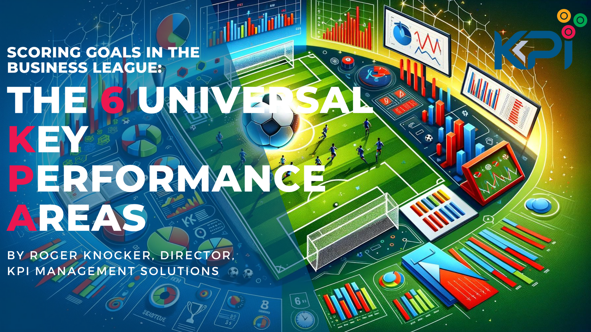
I was invited by a CFO forum to speak about Key Performance Indicators (KPIs). The problem they identified was: “It’s too complex! There are so many KPIs to choose from. There are Quality, Productivity (Quantity), Efficiency, and Timeliness KPIs. We have to deal with Risk and Capability metrics. There are leading and lagging KPIs, and people often confuse them. Plus, there are Financial and Non-Financial KPIs, and Strategic versus Operational KPIs.” They asked me to simplify this for them and suggest no more than 5 KPIs that would help any business, department, or team to: Grow the business Increase efficiency, profitability, and cash flow Build sustainability They also asked me to solve world hunger while I was at it, and if that wasn't possible, at least boil the ocean. I was relieved when they conceded and removed Antarctica from the scope. I thought of some principles that would guide me to the right KPIs and came up with this acronym to make it QUICK: Quantifiable - No subjectivity, only data-driven. Uncomplicated - Simple to gather the data needed. Intuitive (for Practical) - Easy for people to understand in any business and any team. Customizable (for Agile) - Ability for the measurement to be adjusted slightly for the specific situation. KPIs - Key Performance Indicators. After a few agonizing weeks of racking my brain to find just 5 KPIs, I finally gave up. I phoned the chairman of the forum and said, “I can’t narrow it down to just 5 KPIs, but I can get it down to 6. Am I still invited?”

9 Steps to Master Successful Strategy Execution with KPIs - This piece is a detailed step by step guide on how to master strategic execution. Unlock the secrets to successful strategy execution with KPIs. Learn 9 essential steps to master effective strategic execution and achieve your goals. through actionable objectives.

Maximizing Sales Support Performance: A Strategic Approach
Unlocking Excellence in Sales Planning & Analysis: A Strategic Guide
Unlocking Sales Success: Key Performance Areas and KPIs for High Performance Measurement
Driving Sales Order Processing Excellence: Key Focus Areas and Essential KPIs
Maximizing Invoice Collections: Key Areas and KPIs for Performance Excellence
Maximizing Operational Excellence: A Comprehensive Guide to Effective Operations Planning
Maximizing Performance: A Comprehensive Guide to Capex and Project Management
Key Areas to Focus on for High Performance in Managing Assets and Maintenance
Key Focus Areas for High Performance in Distribute or Handover KPIs
Key Focus Areas for Supplier Selection Performance Management
Key Focus Areas for Key Focus Areas for Measuring Buying Performance
Ensuring High Performance in Governance, Risk, and Compliance
Optimizing Transaction Processing & Reporting for Enhanced Performance
Continuous Improvement: Key Focus Areas and Top 20 KPIs
Mastering Workforce Planning: Key Focus Areas and Top KPIs
Key Focus Areas for High Performance in Product Life Cycles and Innovations
Unveiling Success through Business Planning & Budgeting KPIs
Elevating Business Performance: A Comprehensive Guide
Mastering IT Excellence: KPIs for Strategic Success
Ensuring High Performance in Customer Relationships
Optimizing Business Marketing and Advertising Performance
Key Strategies for High Performance in After Sales Support
Key Focus Areas for High-Performance Raw Material and Resource Management
A Management Consultant's Guide Key Focus Areas for Executive Production and Operations
Maximizing Performance: A Comprehensive Guide to Profiling, Recruitment, and Induction KPIs
Key Things to Focus on to ensure High Performance for Training and Development Processes
Maximizing Business Efficiency: A Tactical Approach to IT Transition and User Enablement
Maximizing Efficiency and Effectiveness: Key Aspects for Accounts Payable Clerks
Navigating Success: Crucial Aspects of a Cost & Management Accountant's Role
Mastering Financial Health: Unveiling the Vital Aspects of a Credit Controller’s Role
Navigating Financial Leadership: Essential Aspects and KPIs for a CFO
Achieving Financial Excellence: Key Aspects and KPIs for a Finance Manager
Navigating Financial Excellence: Key Aspects and KPIs for Financial Accountants
Important Aspects of Development Training/Officers
Navigating Excellence: Key Aspects and KPIs for HR Admin & Payroll Officers
Nurturing Excellence: Key Aspects and KPIs for HR Director/Executive
Navigating Success - Crucial Aspects of the Recruiter Role