The 4 Pillars of Performance Management Maturity
Roger Knocker • December 3, 2023
The 4 Pillars of Performance Management Maturity
The Case for Performance Maturity
Many business leaders are unhappy with the performance they are seeing on the bottom line. They instinctively know they can improve the performance of their organizations between 5% and 30% from where they are today. In many cases, there’s even more at stake.
In order to improve this, soon realize that they need a way to manage performance in a logical and objective way.
At this stage, they either don’t know where to start or they call a vendor and ask for a performance management system. There are a few questions that should be asked:
Firstly, what type of performance are you trying to address?
- Financial Performance?
- Process Performance?
- Projects Performance?
- People Performance?
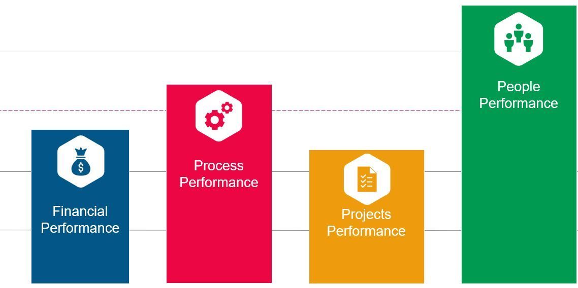
Financial
This is taking a financial view of the world and driving performance by reviewing and managing the financial numbers. Financial disciplines are normally well understood and quite simple to implement.
Process
Every business area has business processes relevant to what is required. In this model we are looking at the processes within the business area including the measurement and reporting that is an outcome of the specific processes.
Projects
Projects includes ad hoc tasks, initiatives, projects and programs. It’s work that isn’t repetitive i.e. it has a defined start and finish date.
People
In this pillar we look at the performance of people and all the aspects that influence their performance.
Secondly, how mature is the existing performance capability in each of the 4 pillars?
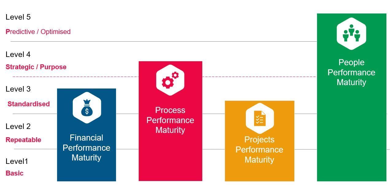
We need to understand that in any organisation, there are levels of maturity in the 4 pillars. Each department or team may have similar levels of maturity, but in most instances the maturity can differ between pillars, and between the same pillars in different departments or teams.
So lets look what performance maturity would look like at each level:
Level 1: Basic Performance Maturity
Processes are typically not documented and only exist in the heads of individuals. There isn’t much measurement and therefore there are no or very few arbitrary performance indicators in place. Process performance is therefore inconsistent and if the processes are successful, its usually only because of the heroics of certain key individuals.
Level 2: Repeatable Performance Maturity
Processes have been implemented in some shape or form. For some of the processes, performance indicators have been implemented to monitor the success of the process. The indicators are typically measured at the end of the processes so that the needs of the process’ customer (internal or external) will be satisfied. There is regular and reliable reporting from the data, however, this reporting needs a certain amount of manual manipulation before it is usable. Often improvement opportunities can be identified through the reporting. Alternatively they can be found when customers complain that they didn’t receive the expected outputs, and someone investigates and uncovers the root cause of the problem.
Level 3: Standardised Performance Maturity
The performance is standardised. Processes are standardised across the business. One department or branch will execute a processes identically to another. Standardised processes are normally executed using a standardised information system. Managers and supervisors manage directly from the workflows and reports generated from the system without any manual manipulation. Performance indicators, reports and dashboards are documented and clear; and management don’t waste time debating where there number comes from. Improvement initiatives and projects are prioritized based on data.
Level 4: Strategic Performance Maturity
The management is strategically moving the organization to a new place. They are therefore looking and planning the future rather than having to put out operational fires, and very seldom get dragged into the operational world. Being strategic normally means growing the business in new markets, new territories and new products. There is significant change in the business at any given moment. The business goals, objectives and target are clearly defined and there are processes to ensure strategic alignment. Key Performance Indicators (KPIs), targets and initiatives are all linked to the strategy of the business.
Level 5: Optimised / Predictive Performance Maturity
The strategy has been implemented and things are working well. Most of the processes and systems are fully automated and only small tweaks to processes and systems are ever needed. They have a high degree of predictability with very little variability. Continuous improvement is a way of life and there is plenty of time for leaders to develop innovative products, services and practices which leads to breakthroughs that bring their own forward momentum. From this place of strength, new strategies keep the organisation at Level 5.
Lastly, In what order should performance improvements be implemented?
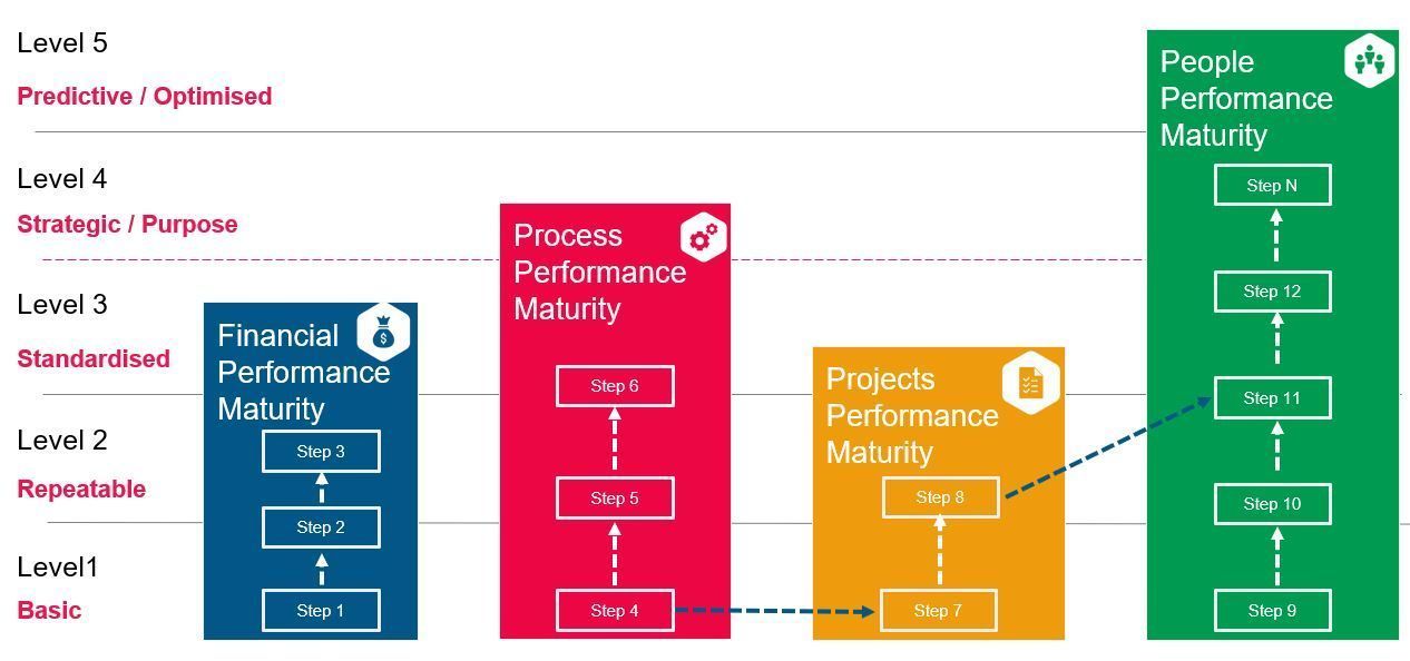
Creating balance in all 4 pillars is healthy for your business. For example, it may not be smart to address People Performance with a new system when Financial /Process/Projects Performance is the real issue?
For each Pillar, your goal should be to get to the next level of maturity. This means that you should look at the items that fall short and take the next logical step in the form of an initiative or project in that pillar. For example if you scored “Repeatable” for Processes, your mini goal should be to get to the “Standardised” level. Your first step could be to document and standardise your Key Performance Indicators (KPIs). Thereafter you can plan to distribute standardised dashboards and reports to managers that need it. Keep repeating the process until you get to your desired level of maturity.
Your next step is often within the same pillar but sometimes there are dependencies between pillars as well as between levels. In the above chart we would only take step 3 after step 2 is completed, and take step 2 after step 1 is completed. Also, step 7 might only be possible if step 4 (which is at the same level in a different pillar) is complete. Step 11 is dependent on step 8 – which is at a lower maturity level in a different pillar. All these things are interlinked and therefore need to be considered as part of your plan.
Be careful not to rush forward with one pillar and leave the others behind. You will be more successful and profitable if you mature each of the pillars to the same level of maturity before you go to the next. Maturing one pillar much more than the other 3 will give you marginal returns (if any), as the pillars are interlinked and need to feed off each other.
NB! Whatever sequence you decide, don’t try and play in the strategic level (Level 4) until all 4 pillars have reached Level 3 ie Standardised. As soon as you stretch your organisation with the changes needed, the organisation will collapse like and pack of cards and you’ll have nothing to show for all your years of hard work. First make sure your business is at level 3 for all 4 pillars before reaching for level 4.
Conclusion and the Performance Maturity Assessment Tool
Without understanding what we’ve described above, you might decide to implement a performance management system from a vendor with a nice shiny tool. The tool itself often fails to add any real value as it doesn’t address the real business problem. Your management and staff may comply with the new system, but they will find it a waste of time.
There are many levers that affect an organisations performance and knowing which one to trigger and in which sequence is complex. Using a bad lever (or a good lever in the wrong sequence) may disrupt your business and have a negative impact on performance. One lever could be a creating a policy. Another could be optimising a process. Another could be implementing a system, and so on.
Before you buy or implement a new Performance Management System, we highly recommend that you figure out the performance maturity of your business and each department. The free assessment below will help you identify your performance maturity and will give you some steps you can take and where to find help along your journey.
Not everyone can run a marathon, most people can’t sprint even 100 meters, but 99.99% of people can take one step. The performance maturity assessment framework that we have developed makes sure it’s one step forward – not sideways and definitely not backwards.

What one construction disaster taught us about process and why every business needs a CAiSY blueprint.

In the world of finance, numbers tell a story. However, that story is often buried beneath layers of spreadsheets and complex datasets. For financial professionals, the challenge is not just about understanding these numbers but also presenting them in a way that drives decision-making and inspires action. Enter data visualisation – the art of transforming data into clear, compelling visuals. Among the tools that have proven especially powerful are the line graph and the waterfall chart. These visuals help finance teams translate dry statistics into impactful narratives. In this article, we explore how these graphs can transform financial storytelling. The Importance of Data Visualisation in Finance Finance professionals are accustomed to handling vast amounts of data, from profit margins and revenue growth to expense tracking and risk assessments. Yet, presenting these figures effectively to stakeholders is a different ballgame. Visualisation simplifies this process, turning complex data sets into accessible insights. When done correctly, data visualisation: Enhances comprehension: Humans process visuals 60,000 times faster than text, making it easier for stakeholders to grasp key information quickly. Drives decision-making: Clear and compelling visuals help executives make informed decisions without wading through dense reports. Highlights trends and outliers: Visual tools can bring hidden trends and anomalies to light, prompting timely actions. Improves understanding and communication with business - Business doesn't always get what Finance is trying to communicate and good visualisations go a long way to bridging the gap. Better communication improves alignment to strategic financial goals. The line Graph: Unravelling Trends Over Time The line graph, also known as a stream graph or a stacked area graph, is a powerful tool for visualising changes in data over time. It is especially effective in showing how multiple categories contribute to an overall trend. In finance, line graphs can illustrate revenue streams, expense categories, or investment performance in a visually engaging manner. Use Case: Revenue Streams Analysis Imagine a financial report for a company with diverse revenue streams, such as product sales, services, and subscriptions. A line graph can display how each stream has evolved, highlighting peaks and troughs. The thickness of each ‘line’ represents the contribution of that revenue stream to the total, making it easy to spot which areas drive growth. Benefits of line Graphs: Trends Made Simple: Displays how multiple components evolve over time. Visual Impact: The fluid, organic design makes it easier to follow changes. Comparative Insight: Helps compare different categories intuitively. The Waterfall Chart: Bridging the Gap Between Figures Waterfall charts excel at breaking down the cumulative effect of sequential data points, making them ideal for financial analysis. They help bridge the gap between figures by showing how individual elements contribute to a total. Commonly used in profit and loss statements, budget analysis, and variance reports, these charts provide clarity in understanding how specific actions impact the bottom line. Use Case: Profit and Loss Analysis A financial analyst preparing a quarterly report might use a waterfall chart to demonstrate how various factors—like increased sales, higher marketing spend, and cost savings—impacted net profit. The chart’s structure, with its clear progression from starting figures to the final result, makes it easy for stakeholders to follow the financial narrative. Benefits of Waterfall Charts: Clarity: Simplifies complex financial data by showing individual contributions to total figures. Transparency: Clearly distinguishes between positive and negative impacts. Decision Support: Helps executives understand the key drivers of financial performance. Choosing the Right Visual for the Right Data Selecting the appropriate visual tool depends on the story you want to tell: Use line graphs for illustrating trends across multiple categories over time. Opt for waterfall charts when you need to detail the step-by-step impact of specific factors on an overall financial figure. By mastering these tools, finance professionals can enhance their storytelling, transforming raw data into insights that drive strategic decisions. Conclusion: From Data to Decisions The ability to visualise data effectively is a powerful advantage. The line graph and waterfall chart are more than just visual aids—they are essential tools for financial professionals looking to make data-driven decisions that resonate with stakeholders. By adopting these techniques, finance teams can turn numbers into narratives that not only inform but also inspire action. In the end, the power of finance lies not just in analysing data but in presenting it with impact.