Blog Layout

SBP022: How to Balance your KPIs Part 3 of 3

Roger Knocker • January 22, 2024

SBP022: How to Balance your KPIs Part 3 of 3


In previous podcasts, we spoke about the importance of balancing KPIs to avoid getting distorted results.


When looking at the selection of KPIs for a team or for the overall business, there is another level of balancing to be added.


The idea was first documented by Robert Kaplan & David Norton who Identified 4 perspectives that KPIs can be grouped by.


1. Financial Perspective – ask yourself, “How is Shareholder value created? The answer to this is normally answered with KPIs that address


  1. Financial Growth
  2. Financial Efficiency
  3. Optimized usage of their funds which includes generating cash, not consuming it


2. Customer Perspective – ask yourself, “What valued our Customer expect from us?” They are normally seeking


  1. Quality Products and Services
  2. Meeting due dates
  3. A competitive price
  4. Good relationships or partnerships
  5. Product leadership and Brand could be important


3. Internal Perspective- ask yourself “to satisfy our shareholders and customers, what internal processes do we need to excel at?” This will typically talk to


  1. Quality processes
  2. Efficiencies continuously improving the cost to produce outputs 
  3. Reducing cycle times of processes
  4. Ensuring good governance
  5. Executing projects on time, in scope and within budget


4. Learning and Growth – ask yourself “how will we sustain and improve the business long term?” This perspective does not address customer-facing activities but rather activities that are behind the scenes such as


  1. Building the capabilities of your people
  2. Optimising IT systems 
  3. Building the environment and culture that is needed


Within each of the above 4 perspectives, you also need to balance between efficiency and effectiveness otherwise you may be driving one at the expense of the other.


Tip 


Group your business and Team KPIs into the 4 perspectives to ensure you have sufficient balance in your KPIs to execute on your strategic goals.


Resources mentioned in the podcast


Visit


www.kpims.co.za/kpis

Www.kpims.co.za/training


If you enjoyed this episode of the Smart Business Performance Podcast, then make sure to subscribe to our podcast.

By Clerissa Holm March 18, 2025
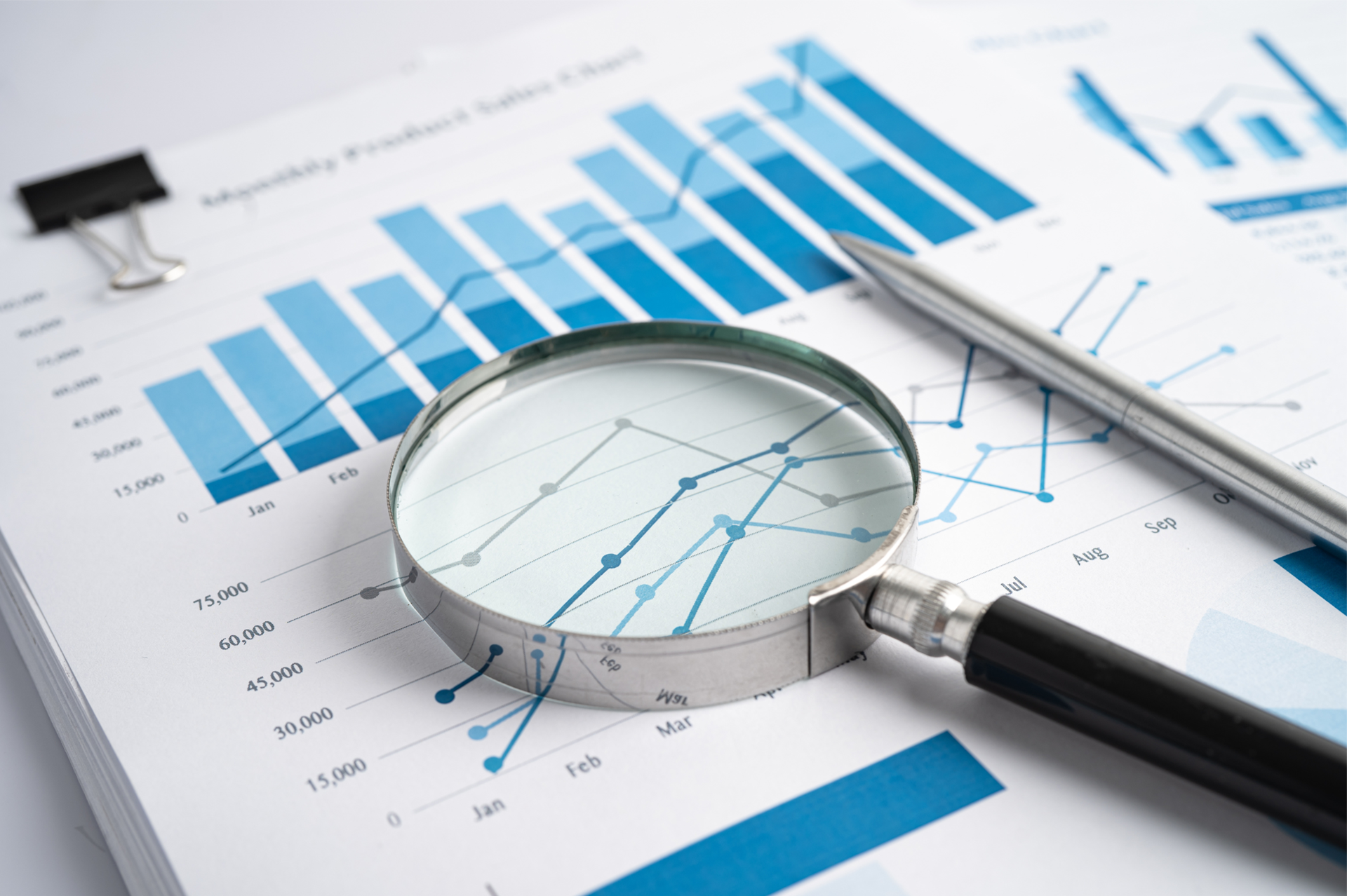
In the world of finance, numbers tell a story. However, that story is often buried beneath layers of spreadsheets and complex datasets. For financial professionals, the challenge is not just about understanding these numbers but also presenting them in a way that drives decision-making and inspires action. Enter data visualisation – the art of transforming data into clear, compelling visuals. Among the tools that have proven especially powerful are the line graph and the waterfall chart. These visuals help finance teams translate dry statistics into impactful narratives. In this article, we explore how these graphs can transform financial storytelling. The Importance of Data Visualisation in Finance Finance professionals are accustomed to handling vast amounts of data, from profit margins and revenue growth to expense tracking and risk assessments. Yet, presenting these figures effectively to stakeholders is a different ballgame. Visualisation simplifies this process, turning complex data sets into accessible insights. When done correctly, data visualisation: Enhances comprehension: Humans process visuals 60,000 times faster than text, making it easier for stakeholders to grasp key information quickly. Drives decision-making: Clear and compelling visuals help executives make informed decisions without wading through dense reports. Highlights trends and outliers: Visual tools can bring hidden trends and anomalies to light, prompting timely actions. Improves understanding and communication with business - Business doesn't always get what Finance is trying to communicate and good visualisations go a long way to bridging the gap. Better communication improves alignment to strategic financial goals. The line Graph: Unravelling Trends Over Time The line graph, also known as a stream graph or a stacked area graph, is a powerful tool for visualising changes in data over time. It is especially effective in showing how multiple categories contribute to an overall trend. In finance, line graphs can illustrate revenue streams, expense categories, or investment performance in a visually engaging manner. Use Case: Revenue Streams Analysis Imagine a financial report for a company with diverse revenue streams, such as product sales, services, and subscriptions. A line graph can display how each stream has evolved, highlighting peaks and troughs. The thickness of each ‘line’ represents the contribution of that revenue stream to the total, making it easy to spot which areas drive growth. Benefits of line Graphs: Trends Made Simple: Displays how multiple components evolve over time. Visual Impact: The fluid, organic design makes it easier to follow changes. Comparative Insight: Helps compare different categories intuitively. The Waterfall Chart: Bridging the Gap Between Figures Waterfall charts excel at breaking down the cumulative effect of sequential data points, making them ideal for financial analysis. They help bridge the gap between figures by showing how individual elements contribute to a total. Commonly used in profit and loss statements, budget analysis, and variance reports, these charts provide clarity in understanding how specific actions impact the bottom line. Use Case: Profit and Loss Analysis A financial analyst preparing a quarterly report might use a waterfall chart to demonstrate how various factors—like increased sales, higher marketing spend, and cost savings—impacted net profit. The chart’s structure, with its clear progression from starting figures to the final result, makes it easy for stakeholders to follow the financial narrative. Benefits of Waterfall Charts: Clarity: Simplifies complex financial data by showing individual contributions to total figures. Transparency: Clearly distinguishes between positive and negative impacts. Decision Support: Helps executives understand the key drivers of financial performance. Choosing the Right Visual for the Right Data Selecting the appropriate visual tool depends on the story you want to tell: Use line graphs for illustrating trends across multiple categories over time. Opt for waterfall charts when you need to detail the step-by-step impact of specific factors on an overall financial figure. By mastering these tools, finance professionals can enhance their storytelling, transforming raw data into insights that drive strategic decisions. Conclusion: From Data to Decisions The ability to visualise data effectively is a powerful advantage. The line graph and waterfall chart are more than just visual aids—they are essential tools for financial professionals looking to make data-driven decisions that resonate with stakeholders. By adopting these techniques, finance teams can turn numbers into narratives that not only inform but also inspire action. In the end, the power of finance lies not just in analysing data but in presenting it with impact.
Financial KPIs Every CFO Should Track in 2025
By Clerissa Holm February 17, 2025
In the ever-evolving financial landscape of 2025, CFOs are tasked with navigating complexities ranging from global economic shifts to technological advancements. The ability to track and analyse the right financial Key Performance Indicators (KPIs) is no longer a luxury but a necessity. These metrics not only provide insight into an organisation’s financial health but also support strategic decision-making. Here are the top financial KPIs every CFO should prioritise in 2025: 1. Revenue Growth Rate Revenue growth is a clear indicator of a company’s ability to generate sales over time. This KPI allows CFOs to evaluate the success of business strategies and identify trends in market demand. Formula: Revenue Growth Rate = [(Current Period Revenue - Previous Period Revenue) / Previous Period Revenue] x 100 Why It Matters: Monitoring revenue growth helps CFOs assess performance against strategic goals and anticipate future cash flow needs. 2. Gross Profit Margin Gross profit margin measures the profitability of core business operations, excluding indirect costs like administrative expenses. Formula: Gross Profit Margin = [(Revenue - Cost of Goods Sold) / Revenue] x 100 Why It Matters: It reveals the efficiency of production processes and pricing strategies, enabling CFOs to identify areas for improvement. 3. Net Profit Margin While gross profit focuses on operational profitability, net profit margin considers all expenses, including taxes and interest. Formula: Net Profit Margin = (Net Income / Revenue) x 100 Why It Matters: A high net profit margin indicates strong financial health and the ability to manage expenses effectively. 4. Cash Conversion Cycle (CCC) The CCC measures how quickly a company can convert its investments in inventory and receivables into cash flow. Formula: CCC = Days Inventory Outstanding + Days Sales Outstanding - Days Payables Outstanding Why It Matters: In 2025, with supply chain disruptions and rising interest rates, efficient cash flow management is critical. The CCC helps CFOs identify bottlenecks and optimise working capital. 5. Operating Expense Ratio (OER) This KPI compares operating expenses to revenue, offering insights into cost management. Formula: OER = (Operating Expenses / Revenue) x 100 Why It Matters: Keeping operating expenses in check is vital for maintaining profitability, especially in uncertain economic climates. 6. Debt-to-Equity Ratio This KPI highlights the financial leverage of the company by comparing total liabilities to shareholder equity. Formula: Debt-to-Equity Ratio = Total Liabilities / Shareholder Equity Why It Matters: With interest rates fluctuating in 2025, maintaining a healthy balance between debt and equity is crucial to avoid over-leveraging. 7. Return on Equity (ROE) ROE measures the efficiency of a company in generating profits from shareholders' investments. Formula: ROE = (Net Income / Shareholder Equity) x 100 Why It Matters: A strong ROE signals to investors that the company is effectively using their capital, which is vital for securing future funding. 8. Earnings Before Interest, Taxes, Depreciation, and Amortisation (EBITDA) EBITDA provides a clear picture of operational profitability without the influence of financing and accounting decisions. F ormula: EBITDA = Net Income + Interest + Taxes + Depreciation + Amortisation Why It Matters: CFOs use EBITDA to benchmark performance against competitors and industry standards, making it a key metric for strategic planning. 9. Customer Acquisition Cost (CAC) As businesses invest in growth strategies, understanding the cost of acquiring new customers becomes crucial. Formula: CAC = Total Sales and Marketing Expenses / Number of New Customers Acquired Why It Matters: Tracking CAC helps CFOs ensure marketing spend aligns with long-term profitability goals. 10. Economic Value Added (EVA) EVA measures the value a company generates beyond the required return of its shareholders. Formula: EVA = Net Operating Profit After Taxes (NOPAT) - (Capital Employed x Cost of Capital) Why It Matters: EVA provides a holistic view of financial performance, emphasising value creation over short-term profits. Final Thoughts In 2025, CFOs must adopt a forward-thinking approach, leveraging advanced analytics and real-time reporting tools to stay ahead. By focusing on these essential financial KPIs, CFOs can drive strategic growth, ensure resilience, and foster long-term success in an increasingly competitive landscape. Tracking these metrics isn’t just about numbers; it’s about enabling informed decisions that align with the company’s vision and goals.
Share by: