QlikView Dashboards
Roger Knocker • December 5, 2023
QlikView Dashboards
Wouldn’t you like to have all your KPIs from many sources in a single dashboard?
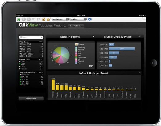
QlikView consolidates relevant data from multiple sources into a single application. It presents that data in a rich user friendly way. The visualisation is provided with modern graphical view showing data in different types of charts, dashboards, maps and data reports. QlikView enables departments and teams to perform social decision making through secure, real-time collaboration. It allows users to access their data through a standard web interface and supports secure remote and mobile use.
The system is intuitive and requires very little end-user training. The agility of QlikView allows for rapid deployment.
Who is Qliktech?
QlikView is a product of Qliktech which is listed company on the New York Stock exchange. Forbes recently ranks it as the 3rd fastest technology company in America behind Apple and Linked in. It was founded in Sweden in 1993 and has over 26,000 Customers in more than 100 Countries with over 700,000 users.
What success do QlikView clients achieve?
QlikView provides many benefits to clients from having better visibility of the business and being able to make better business decisions and therefore drive efficiencies, improve customer service and reduce business risks.
A recent survey conducted by the Independent Data Corporation concluded that QlikView customers had improved their financial results. The survey was performed on 742 customers of different sizes, in different countries ad industries internationally across different industries. On average these customers had the following business benefits:
- 16% Increase in Revenue
- 20% Reduction in operating costs
- 23% Improvement in Cashflow
- 34% Improvement in employee productivity (for those using QlikView)
Why is QlikView so Successful?
QlikView provides fast, powerful and visual in-memory business analysis – without the limitations, cost or complexity of traditional BI tools. QlikView can be deployed in days and users trained in minutes. Designed specifically for business users, QlikView puts information at your fingertips instantly, giving you the intelligence you need to act – faster
QlikView’s innovative approach results in significant benefits for our customers.
- Fast Implementation – Customers are live in less than 30 days, and most in a week.
- Easy to Use – End users require minimal or no training and enjoy “qliking” through the application.
- Powerful – Near instant response time on data volumes as high as a billion records across thousands of users.
- Agile – Allows unlimited dimensions and measures and can be modified in seconds.
- Integrated – Dashboards, analysis and reporting in a single solution and on a single architecture.
- Low Cost – Less costly, shorter implementations result in fast return on investment.
- Risk-Free – Fully-functional free trial download and 30 day money-back guarantee.
- Mobile Ready – The same information and app access privileges apply regardless of the device used, and data does not physically reside on these devices. QlikView provides a complete Business Discovery experience—including interactive analysis, rich visualization, and associative search.

What one construction disaster taught us about process and why every business needs a CAiSY blueprint.
In the world of finance, numbers tell a story. However, that story is often buried beneath layers of spreadsheets and complex datasets. For financial professionals, the challenge is not just about understanding these numbers but also presenting them in a way that drives decision-making and inspires action. Enter data visualisation – the art of transforming data into clear, compelling visuals. Among the tools that have proven especially powerful are the line graph and the waterfall chart. These visuals help finance teams translate dry statistics into impactful narratives. In this article, we explore how these graphs can transform financial storytelling. The Importance of Data Visualisation in Finance Finance professionals are accustomed to handling vast amounts of data, from profit margins and revenue growth to expense tracking and risk assessments. Yet, presenting these figures effectively to stakeholders is a different ballgame. Visualisation simplifies this process, turning complex data sets into accessible insights. When done correctly, data visualisation: Enhances comprehension: Humans process visuals 60,000 times faster than text, making it easier for stakeholders to grasp key information quickly. Drives decision-making: Clear and compelling visuals help executives make informed decisions without wading through dense reports. Highlights trends and outliers: Visual tools can bring hidden trends and anomalies to light, prompting timely actions. Improves understanding and communication with business - Business doesn't always get what Finance is trying to communicate and good visualisations go a long way to bridging the gap. Better communication improves alignment to strategic financial goals. The line Graph: Unravelling Trends Over Time The line graph, also known as a stream graph or a stacked area graph, is a powerful tool for visualising changes in data over time. It is especially effective in showing how multiple categories contribute to an overall trend. In finance, line graphs can illustrate revenue streams, expense categories, or investment performance in a visually engaging manner. Use Case: Revenue Streams Analysis Imagine a financial report for a company with diverse revenue streams, such as product sales, services, and subscriptions. A line graph can display how each stream has evolved, highlighting peaks and troughs. The thickness of each ‘line’ represents the contribution of that revenue stream to the total, making it easy to spot which areas drive growth. Benefits of line Graphs: Trends Made Simple: Displays how multiple components evolve over time. Visual Impact: The fluid, organic design makes it easier to follow changes. Comparative Insight: Helps compare different categories intuitively. The Waterfall Chart: Bridging the Gap Between Figures Waterfall charts excel at breaking down the cumulative effect of sequential data points, making them ideal for financial analysis. They help bridge the gap between figures by showing how individual elements contribute to a total. Commonly used in profit and loss statements, budget analysis, and variance reports, these charts provide clarity in understanding how specific actions impact the bottom line. Use Case: Profit and Loss Analysis A financial analyst preparing a quarterly report might use a waterfall chart to demonstrate how various factors—like increased sales, higher marketing spend, and cost savings—impacted net profit. The chart’s structure, with its clear progression from starting figures to the final result, makes it easy for stakeholders to follow the financial narrative. Benefits of Waterfall Charts: Clarity: Simplifies complex financial data by showing individual contributions to total figures. Transparency: Clearly distinguishes between positive and negative impacts. Decision Support: Helps executives understand the key drivers of financial performance. Choosing the Right Visual for the Right Data Selecting the appropriate visual tool depends on the story you want to tell: Use line graphs for illustrating trends across multiple categories over time. Opt for waterfall charts when you need to detail the step-by-step impact of specific factors on an overall financial figure. By mastering these tools, finance professionals can enhance their storytelling, transforming raw data into insights that drive strategic decisions. Conclusion: From Data to Decisions The ability to visualise data effectively is a powerful advantage. The line graph and waterfall chart are more than just visual aids—they are essential tools for financial professionals looking to make data-driven decisions that resonate with stakeholders. By adopting these techniques, finance teams can turn numbers into narratives that not only inform but also inspire action. In the end, the power of finance lies not just in analysing data but in presenting it with impact.