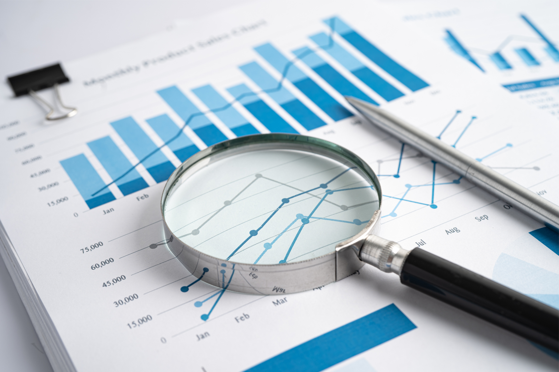
Inventory Optimisation Dashboard
Roger Knocker • November 26, 2023
Inventory Optimisation Dashboard
The right product at the right time will improve customer satisfaction and will enhance your profitability and cash flow.
Inventory sits at the heart of all supply chain issues. High inventory levels hide a host of management evils. Inappropriate inventory levels are the strongest internal indicator of a poorly informed or poorly managed supply chain. For this reason, it is critical that all managers associated with any element of the supply chain make frequent use of this dashboard.
Typically the most significant drivers of inventory levels are not associated directly with inventory management, but rather with:
This Dashboard is intended to assist the management team to assess whether the levels of inventory are optimised and to help identify possible inventory problems.
This dashboard includes the following:
This section of the dashboard includes:
The dashboard shows balances as at today but also shows the trend of balances at daily, weekly and monthly levels.
It also allows mangers to go back to see what the balances were at a point in time at an SKU and at an aggregated level.
It’s important to aggregate the balances by:
Typically the most significant drivers of inventory levels are not associated directly with inventory management, but rather with:
- Poor business planning
- Revenue / Demand Forecasting is absent, high level, or not done scientifically or collaboratively
- Supply planning is done on the back of a cigarette box
- Operations measured on efficiencies and not plan adherence
- Poor warehouse and logistics management
This Dashboard is intended to assist the management team to assess whether the levels of inventory are optimised and to help identify possible inventory problems.
This dashboard includes the following:
Stock Accuracy
From an inventory management point of view, the most critical issue is stock accuracy. Why:- Planning can be done more accurately
- Promised delivery dates to customers can be more predictable
- Procurement needs this information to assess the volume of items to be ordered to keep the right levels of safety without over stocking
- More efficient warehouse management e.g. easier to find stock, better stock rotation etc. which drives down holding costs
- Good governance and reduces loss and theft.
This section of the dashboard includes:
- Number of Stock Takes
- Value of Items Counted
- Value of Discrepancies
- Absolute Value of Adjustments
- % of items in correct location
Balances
The dashboard shows balances as at today but also shows the trend of balances at daily, weekly and monthly levels.
It also allows mangers to go back to see what the balances were at a point in time at an SKU and at an aggregated level.
It’s important to aggregate the balances by:
- Inventory Group/ Class
- Type
- Warehouse
- Region
- Customer Specific Items
JIT Waste Index
The JIT waste index is calculated as (A – B) where:
The waste index shows the excessive inventory on hand and over time. It quantifies the value of excessive inventory at any point in time. Using 80/20 principles, it becomes quite easy to optimise the inventory by focussing on the wasteful item
- A = Average weekly Balance
- B = Average consumption of the inventory (through sales, transfers or issues to production)
The waste index shows the excessive inventory on hand and over time. It quantifies the value of excessive inventory at any point in time. Using 80/20 principles, it becomes quite easy to optimise the inventory by focussing on the wasteful item
Movements
The dashboard shows you the movement in inventory between any two points in time. This is extremely useful for reconciling balances and can also be viewed in grid format.

What one construction disaster taught us about process and why every business needs a CAiSY blueprint.
In the world of finance, numbers tell a story. However, that story is often buried beneath layers of spreadsheets and complex datasets. For financial professionals, the challenge is not just about understanding these numbers but also presenting them in a way that drives decision-making and inspires action. Enter data visualisation – the art of transforming data into clear, compelling visuals. Among the tools that have proven especially powerful are the line graph and the waterfall chart. These visuals help finance teams translate dry statistics into impactful narratives. In this article, we explore how these graphs can transform financial storytelling. The Importance of Data Visualisation in Finance Finance professionals are accustomed to handling vast amounts of data, from profit margins and revenue growth to expense tracking and risk assessments. Yet, presenting these figures effectively to stakeholders is a different ballgame. Visualisation simplifies this process, turning complex data sets into accessible insights. When done correctly, data visualisation: Enhances comprehension: Humans process visuals 60,000 times faster than text, making it easier for stakeholders to grasp key information quickly. Drives decision-making: Clear and compelling visuals help executives make informed decisions without wading through dense reports. Highlights trends and outliers: Visual tools can bring hidden trends and anomalies to light, prompting timely actions. Improves understanding and communication with business - Business doesn't always get what Finance is trying to communicate and good visualisations go a long way to bridging the gap. Better communication improves alignment to strategic financial goals. The line Graph: Unravelling Trends Over Time The line graph, also known as a stream graph or a stacked area graph, is a powerful tool for visualising changes in data over time. It is especially effective in showing how multiple categories contribute to an overall trend. In finance, line graphs can illustrate revenue streams, expense categories, or investment performance in a visually engaging manner. Use Case: Revenue Streams Analysis Imagine a financial report for a company with diverse revenue streams, such as product sales, services, and subscriptions. A line graph can display how each stream has evolved, highlighting peaks and troughs. The thickness of each ‘line’ represents the contribution of that revenue stream to the total, making it easy to spot which areas drive growth. Benefits of line Graphs: Trends Made Simple: Displays how multiple components evolve over time. Visual Impact: The fluid, organic design makes it easier to follow changes. Comparative Insight: Helps compare different categories intuitively. The Waterfall Chart: Bridging the Gap Between Figures Waterfall charts excel at breaking down the cumulative effect of sequential data points, making them ideal for financial analysis. They help bridge the gap between figures by showing how individual elements contribute to a total. Commonly used in profit and loss statements, budget analysis, and variance reports, these charts provide clarity in understanding how specific actions impact the bottom line. Use Case: Profit and Loss Analysis A financial analyst preparing a quarterly report might use a waterfall chart to demonstrate how various factors—like increased sales, higher marketing spend, and cost savings—impacted net profit. The chart’s structure, with its clear progression from starting figures to the final result, makes it easy for stakeholders to follow the financial narrative. Benefits of Waterfall Charts: Clarity: Simplifies complex financial data by showing individual contributions to total figures. Transparency: Clearly distinguishes between positive and negative impacts. Decision Support: Helps executives understand the key drivers of financial performance. Choosing the Right Visual for the Right Data Selecting the appropriate visual tool depends on the story you want to tell: Use line graphs for illustrating trends across multiple categories over time. Opt for waterfall charts when you need to detail the step-by-step impact of specific factors on an overall financial figure. By mastering these tools, finance professionals can enhance their storytelling, transforming raw data into insights that drive strategic decisions. Conclusion: From Data to Decisions The ability to visualise data effectively is a powerful advantage. The line graph and waterfall chart are more than just visual aids—they are essential tools for financial professionals looking to make data-driven decisions that resonate with stakeholders. By adopting these techniques, finance teams can turn numbers into narratives that not only inform but also inspire action. In the end, the power of finance lies not just in analysing data but in presenting it with impact.